


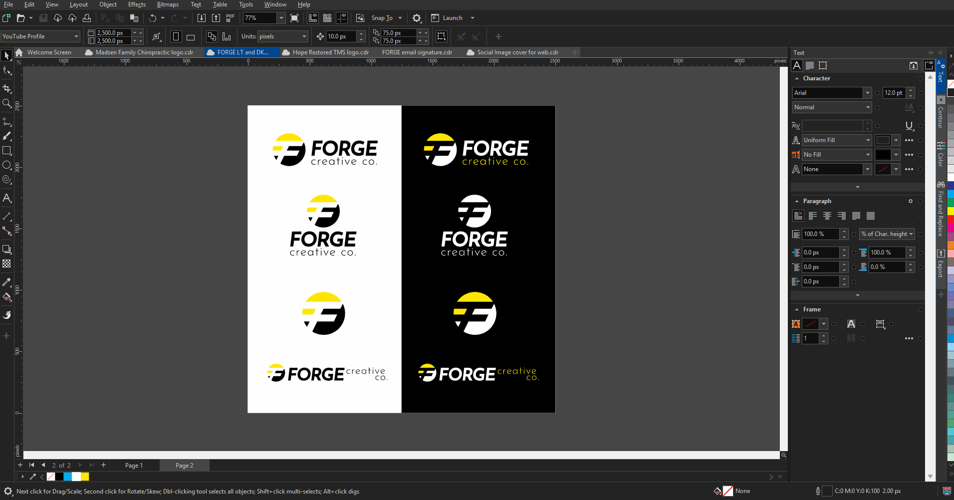

1. Symbol Logos (Pictorial or Abstract Marks) A symbol logo uses a graphic element — either representational (pictorial) or abstract — to represent a brand. Often, a wordmark supports it, especially in early brand development. . Why Businesses Choose Symbols Strong at small sizes Flexible across layouts (multiple “lockups”) Transcend language barriers Can eventually stand alone The Reality They require repetition to build recognition They’re costly and time-consuming to establish independently Without exposure, they carry no inherent meaning When It Works Best Symbols are powerful for brands with growth ambitions — especially those wanting scalability across products, locations, or languages. FORGE Perspective: We often pair symbols with typography early on. Over time, as brand recognition builds, the symbol can earn the right to stand alone. 2. Monograms & Letterforms Monograms combine two or more letters into a mark. Letterforms focus on a single letter. Both are often supported by a wordmark . Why Businesses Choose Them Quick to explore conceptually Clean and minimal Excellent at small sizes Work well for established names or personal brands The Reality Hard to make truly original Not ideal for international brands needing universal symbolism Can lack depth without strong supporting branding When It Works Best If your business name is already established and recognizable, a refined monogram can feel confident and elevated. FORGE Perspective: We use monograms strategically — especially when building sub-brands, premium tiers, or product lines within a larger brand ecosystem. 3. Wordmarks & Lettermarks Wordmarks use the full company name in a distinctive type treatment. Lettermarks use a recognizable abbreviation of the name Why Businesses Choose Them Immediate clarity Strong name reinforcement Often quicker to develop The Reality Long names become problematic Typography alone can lack memorability Abbreviations only work when audiences already know them When It Works Best New businesses that need name recognition benefit from wordmarks. They remove ambiguity and build brand recall quickly. FORGE Perspective: We typically recommend full names over abbreviations unless your audience already uses the shortened version naturally. 4. Combination Marks A combination mark merges a symbol and a wordmark — either side-by-side, stacked, or integrated together. . Why Businesses Choose Them Clear and memorable Immediate brand recognition Balanced visual identity The Reality Often less flexible if typography and symbol are tightly fused Usually designed in one primary configuration When It Works Best This is the most versatile and most common professional approach — especially for small to mid-sized businesses building recognition. FORGE Perspective: Most of our clients begin with a combination mark because it provides clarity and growth flexibility. It’s strategic. It’s scalable. It’s Built to Brand. 5. Emblems, Crests & Badges These marks combine text and imagery within a framed or enclosed shape . Why Businesses Choose Them Convey tradition, prestige, and heritage Tell layered visual stories Feel established and official The Reality Limited versatility Hard to reproduce at small sizes Often complex to design well When It Works Best Ideal for organizations with history — schools, municipalities, legacy businesses, or heritage-driven brands. FORGE Perspective: If your brand narrative is rooted in tradition and legacy, an emblem can be powerful — but it must be simplified strategically for modern applications. 6. Mascots Mascots feature illustrated characters — people, animals, or even objects — that personify the brand. Why Businesses Choose Them Add personality and warmth Build strong emotional connection Function as flexible marketing assets The Reality Time-intensive to create properly May not translate universally across cultures Require ongoing brand consistency When It Works Best Brands that want to lead with personality — especially in community-focused or relationship-driven industries. FORGE Perspecti ve: Mascots are powerful when integrated thoughtfully into a broader brand system — not when they replace strateg y. So… Which Logo Style Is Right for You? The truth is: There isn’t a “best” logo style. There’s only the style that best aligns with your: Growth vision Industry positioning Audience psychology Long-term scalability Brand personality That’s why at FORGE, we don’t start with style. We start with strategy. Your logo isn’t just artwork. It’s a tool. It should: Work in the corner of your business card AND on a billboard Function in black and white Adapt across digital, print, apparel, signage, and social Grow with your business A logo isn’t designed in isolation. It’s forged — intentionally — inside a brand system. Final Thought: Built to Brand Many businesses rush into logo design because they want something that “looks professional.” But professionalism isn’t about decoration. It’s about direction. If you’re ready to move beyond just a logo — and build a brand that’s scalable, strategic, and built for growth — that’s where we step in. Your business deserves more than a mark. It deserves a foundation. And that’s exactly what we build.

Discover why AI-friendly websites matter and how optimizing for modern search helps your business stay visible and competitive online.
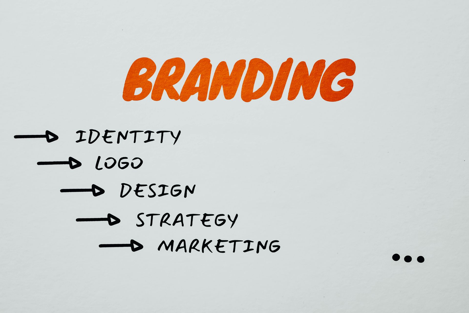
Learn what branding really means, why it matters, and how defining your “why” helps your business connect with customers and grow.